Show vs. Tell - Part 2
Headlines
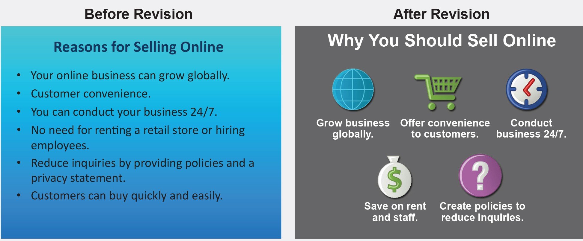
The headline to every slide should represent the key takeaway as in this actual example from a presentation to Audi management.
More than just an automobile
Now use data points & factoids that prove the headline statement made has merit. EG: “Had 5 star reviews from 8 of the top 10 automotive critics”.
Show one point at a time
Many presentations are created as a leave behind and not presentation aids.
These are fine if you are not present. The leave behind of the slides becomes your “stand-in” presenter.
However, when you are present, take ownership of the data, making the audience pay attention to what’s coming up next. (remembering audiences can read 6 - 7 times faster than you can speak)
Not doing this removes all the surprise, intrigue and captivating theatre from presentations. ZZZzzz!
Action: Build each point separately.
Three methods. 1) Separate slides, 2) Build each point separately (part of slide animation) or 3) cover up components of the slide you then remove using the animations tool.
Never read to the screen
It’s easier said than done. However, the simplest solution is to follow tips 1 & 2 above.
The minute you overcrowd your slide with data, the inadvertent byproduct is that you WILL start reading to it.
Let the aid SHOW what you are saying
Aids beyond slides
Think of your 5 senses.
Products, demonstrations, handouts, tours, video, music, white/blackboards, flipcharts, props and artifacts. For those of you who present exclusively on-line, most all of these can be incorporated in some form or another. Get creative!
All of these will help you stimulate and speak to each of these other senses, ensuring an engaged audience.
The most powerful aid of them all
The audience themselves, engaged, doing something interesting that has them experience and thus recognize the value of what you are presenting.
Famous case in point.
Client: Harley Davison. Agency: Carmichael Lynch. Print Ad Headline: “Somewhere on an airplane a man is trying to rip open a small bag of peanuts”
Agency Demonstration: Agency set up seats in the conference room duplicating an airplanes cramped 4 seats across and 4 rows deep. Had client sit in them. Reenacted walking down aisle, bumping into passengers, tossing them small bags of peanuts.
Having stirred up and stimulated clients emotions, forcing them into an uncomfortable situation - paused for effect. - then asked, “Anyplace you’d prefer to be right now?”
Then - revealed the ad and had the client sitting in the front row (CMO) read out the script for all to hear.
SOLD!


